Start with real team data
Test the longest Arabic and English names, titles, email addresses and phone numbers before the grid is approved. A card designed around one short example often breaks across a full team.
Balance the two scripts
Arabic and Latin typography do not need identical sizes to have equal presence. Compare visual weight, line length and spacing at the actual printed scale.
Choose stock before stacking finishes
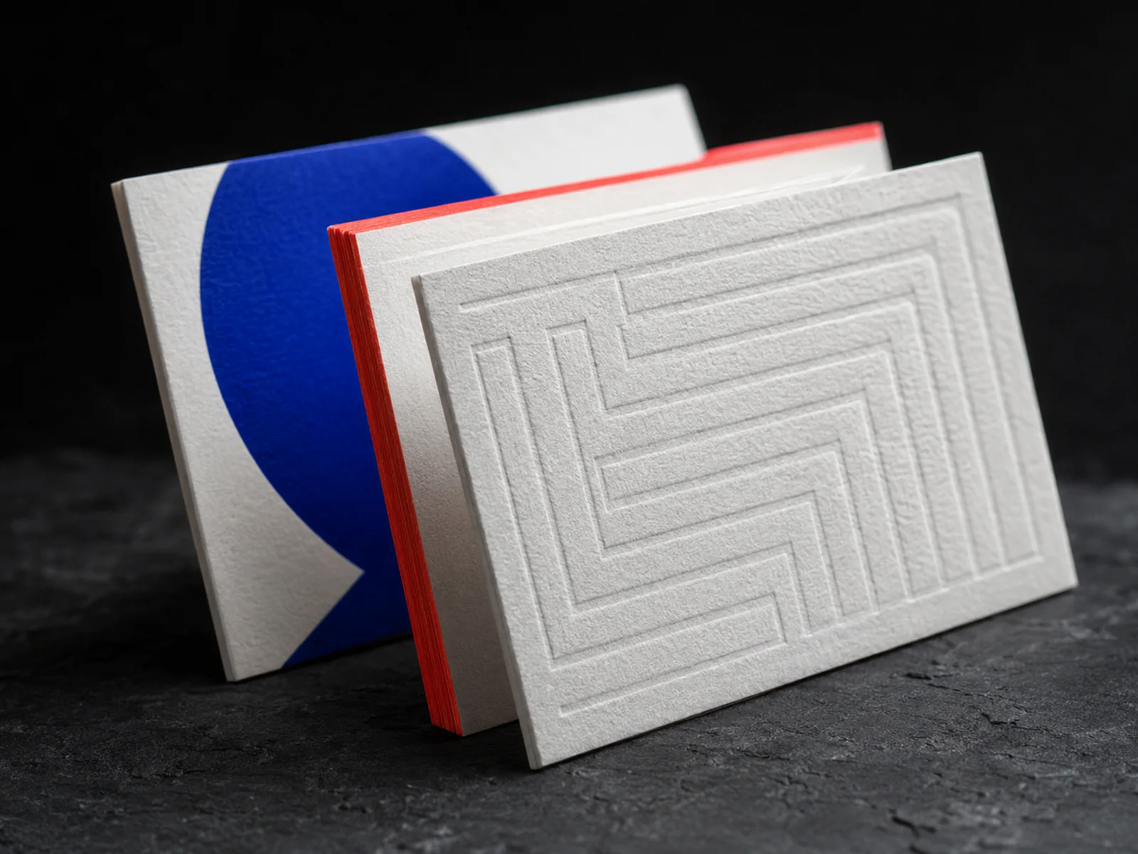
Paper colour, fibre, stiffness and surface already communicate a great deal. Decide whether foil, pressure or edge colour adds something distinct instead of treating every finish as a checklist item.
Design the reorder workflow
Keep a controlled master, data sheet and approved specification so new team members can be added without recreating the card or drifting from the original colour.
Approve in the hand
Check text size, surface, thickness, foil glare and pocket behaviour under normal light. A large on-screen proof hides the real experience.